Having a separate mobile banner image allows you to load a smaller image and just display one image on mobile. This has a very positive impact on load speed on mobile.
Instead of simply showing the centre of the desktop image, you can crop the image to show the best part of the image, so you have more control over what displays. On average 75% of website traffic is now on mobile, so three out of four visitors to your site will see this image as their first impression of your property – so you want it to be a great one!!
Managing mobile images on all page layouts is the same. If left blank, it will show just the centre of the first image on the desktop banner carousel.
Step 1: Upload your image:
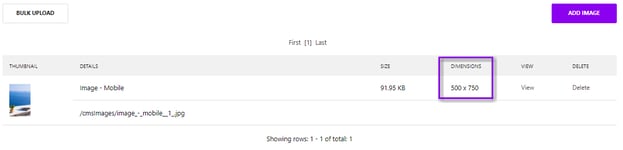
- The file size may be different dimensions depending on your site, but they will be in a 4:6 ratio e.g. 400 x 600 pixels, 500 x 750 pixels or 375 x 560 pixels. There will be a mobile image loaded here for you to check this on your site.
- We recommend resizing a copy of the image on your desktop first, and then running through https://tinypng.com/ to compress the file size without hampering the quality, then uploading it to the CMS.
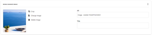
- Upload your the image into MEDIA > IMAGES.
- TOP TIP: When uploading, we suggest having a clear naming convention e.g. Property Name Exterior – Mobile, or Property Name Bar – Mobile, so that you can find the mobile images much more quickly when selecting on the page.
Step Two: Add your image to page:
Once your image has been uploaded, it's time to add it to a page.
- Go to the specific page, and select the required image under within the page settings ADVANCED SETTINGS > MOBILEBANNER
- Then you can Preview or Save, and always remember to look at it on a mobile device to ensure it looks as you intended it to.